The Brief
The task was to create an adaptable, expandable visual identity for a burger & craft-beer establishment that reflected the brand core-value of perfecting the basics.
The product of that challenge, is a no-gimmicks visual approach that feels both premium and convenient, as well as being simple but carefully crafted.
The Process
Discover:
An analysis of the project brief and client description identified key values, business aims and the brands story. In-depth visual research of similar, competing, and stand-out establishments helped to identify visual gaps in the market which Flint could occupy.
Define:
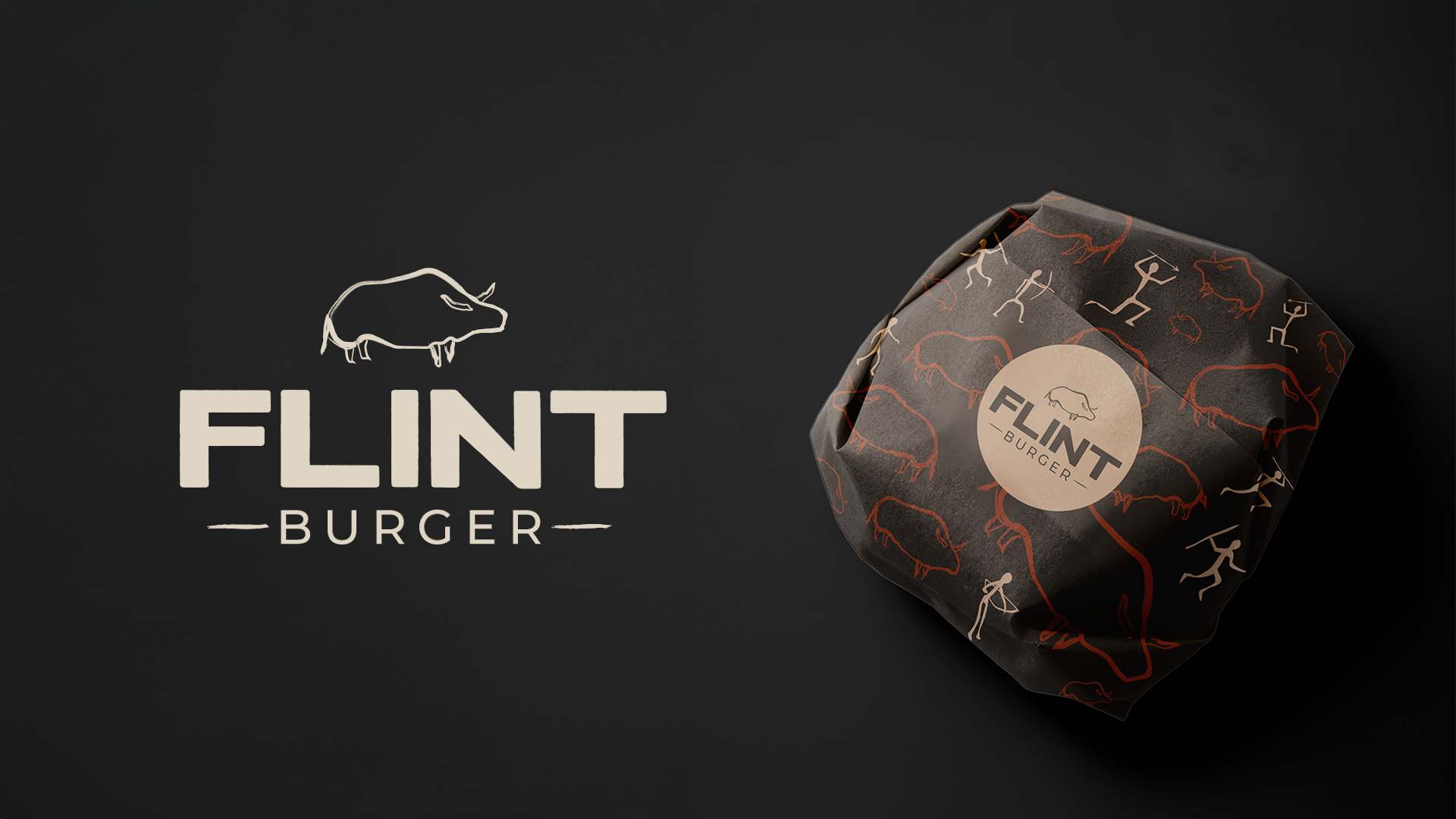
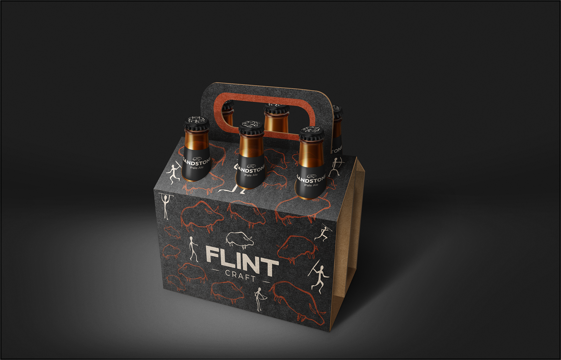
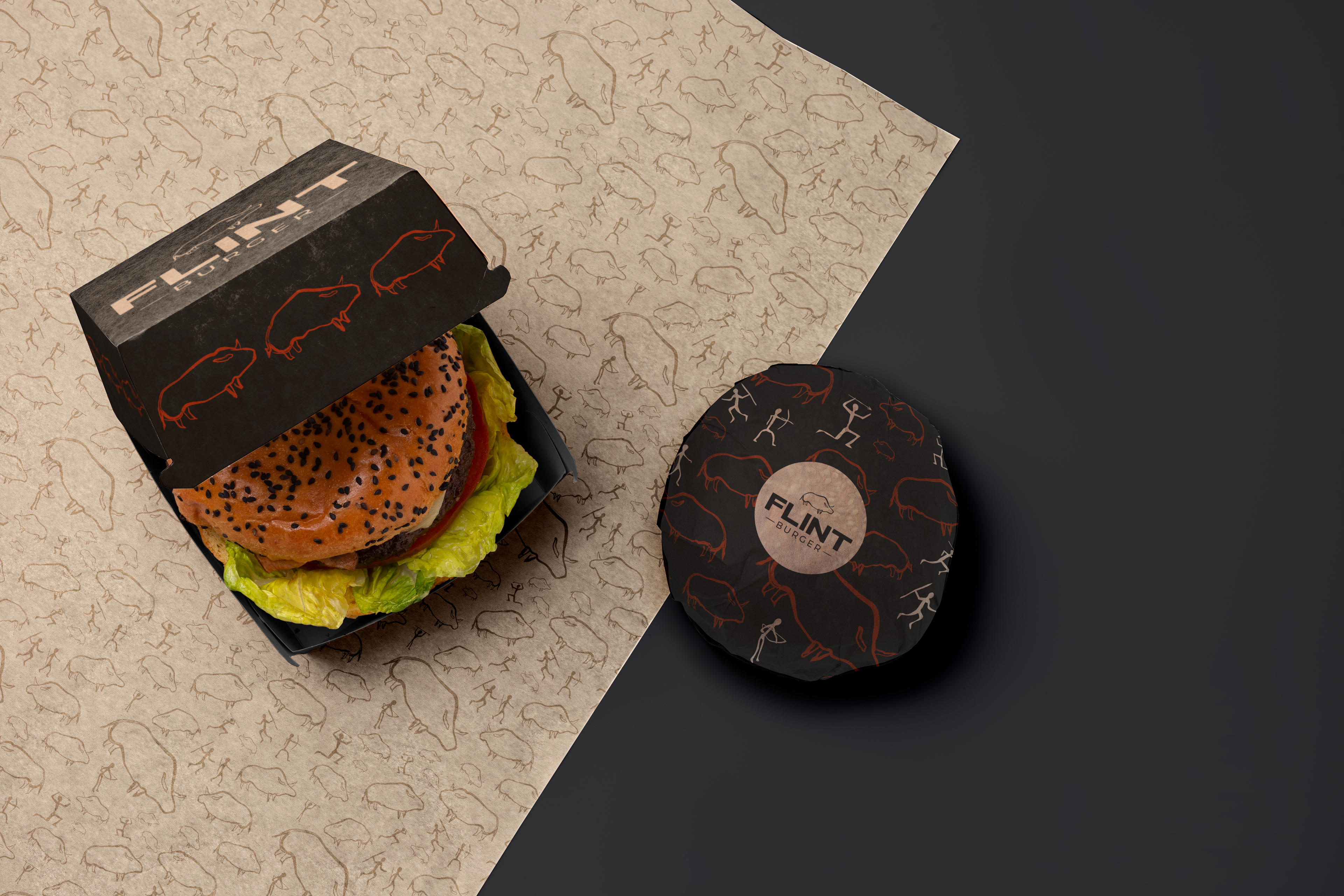
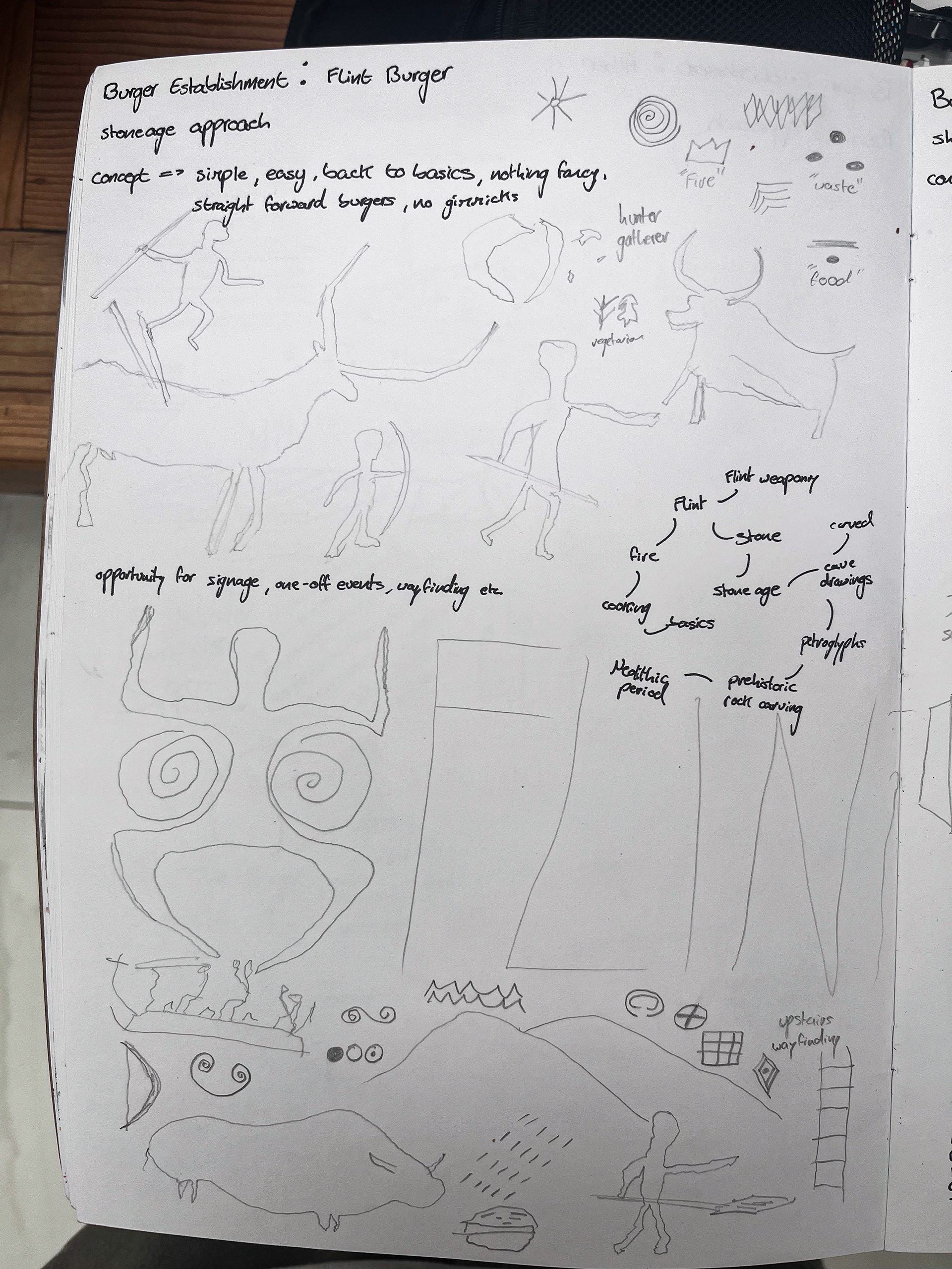
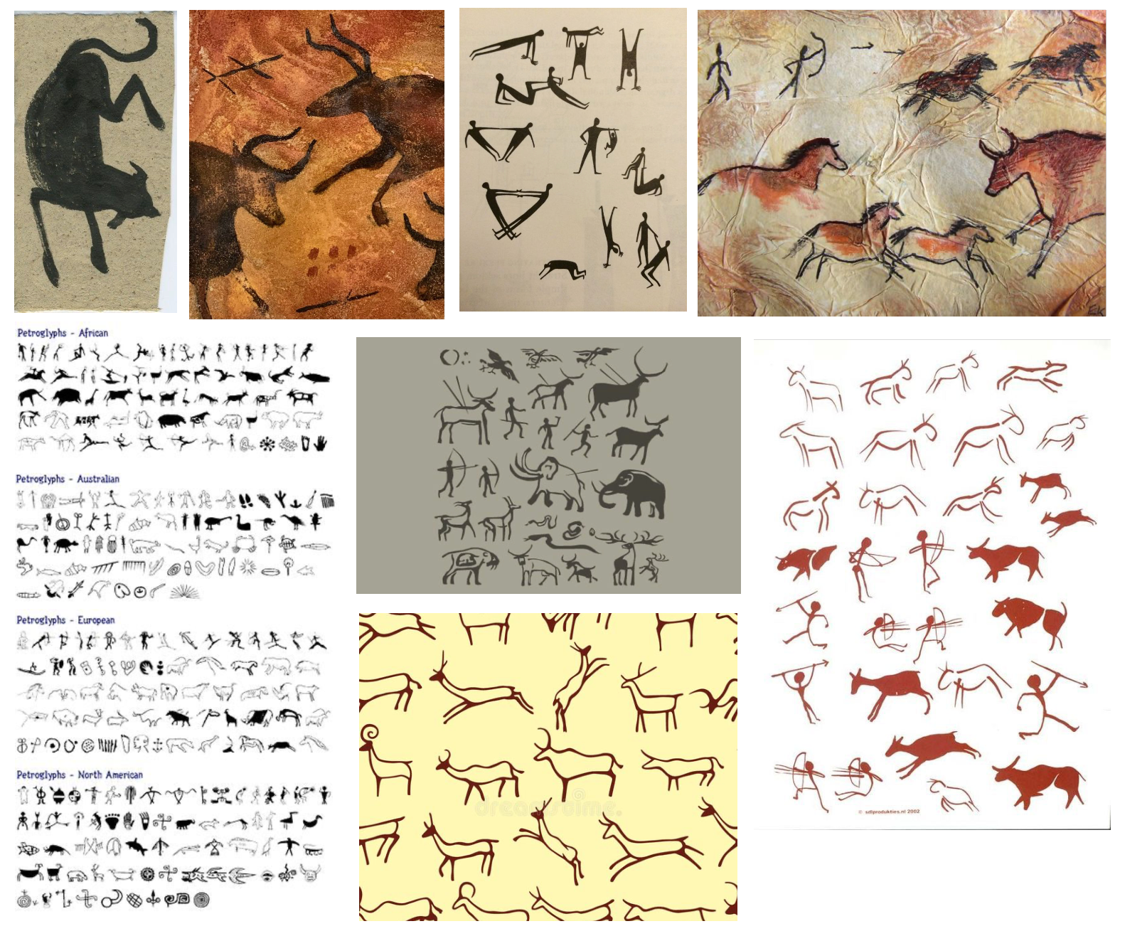
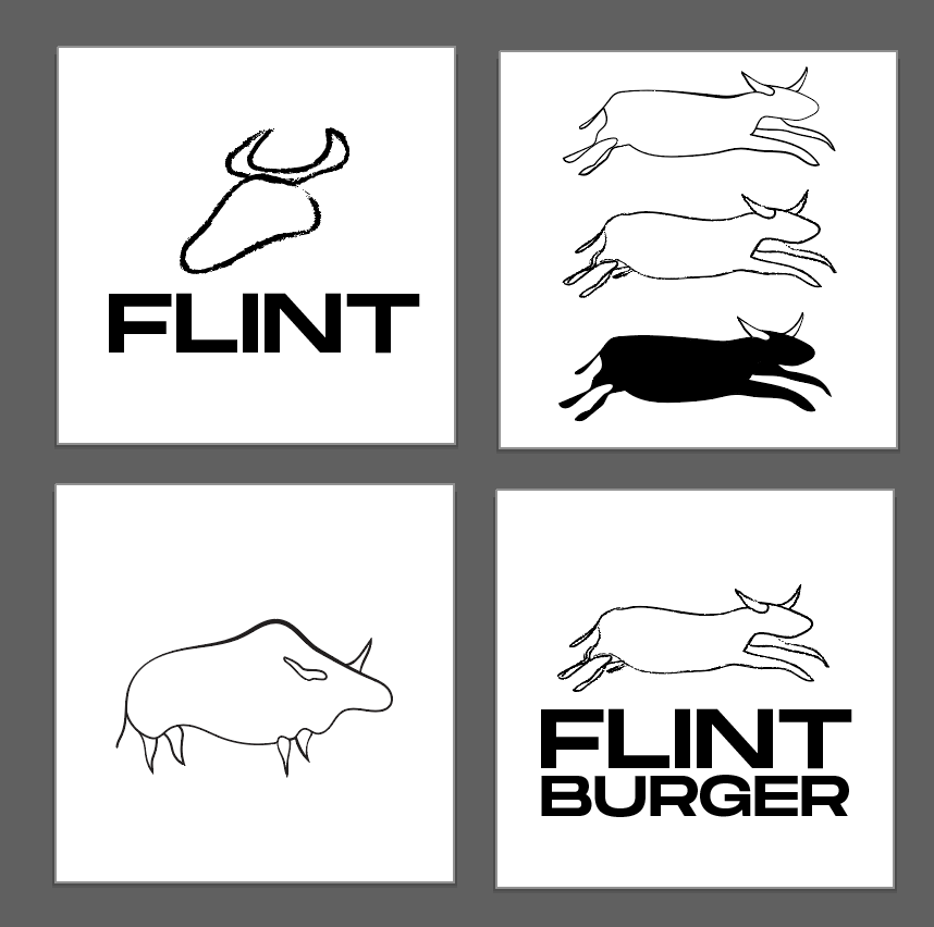
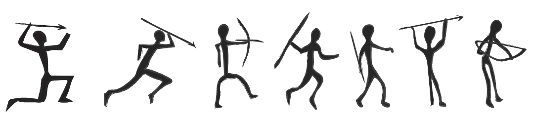
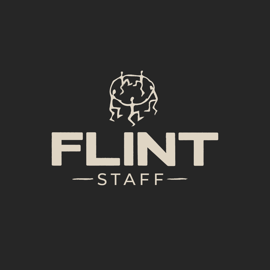
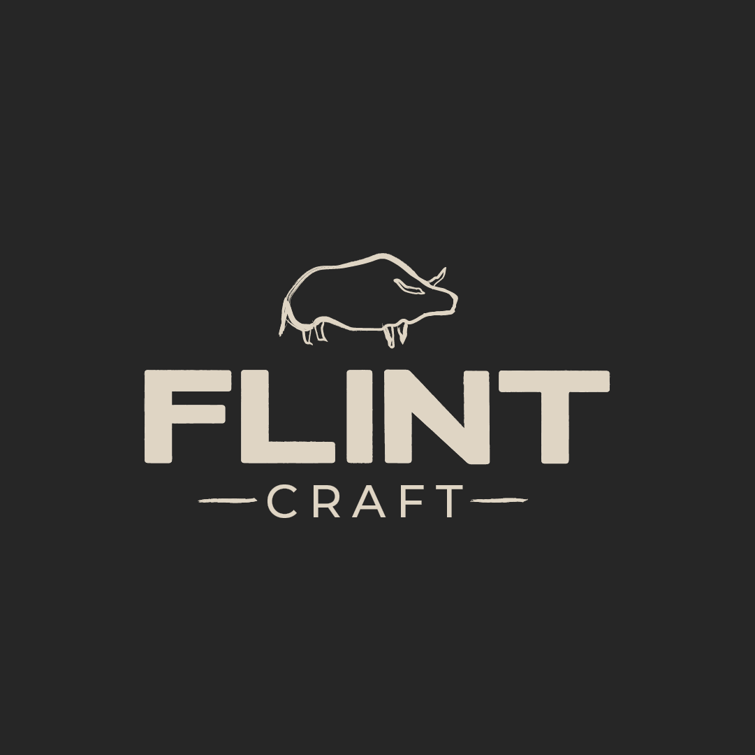
With the establishments name defined as 'Flint' and a core emphasis on perfected basics, I identified the key inspiration for the visuals from the neolithic period, where flint held vital significance and the basics were perfected for survival.
Develop & Deliver:
Client analysis, visual and contextual research allowed for the development and delivery of an unexampled approach.
The Approach
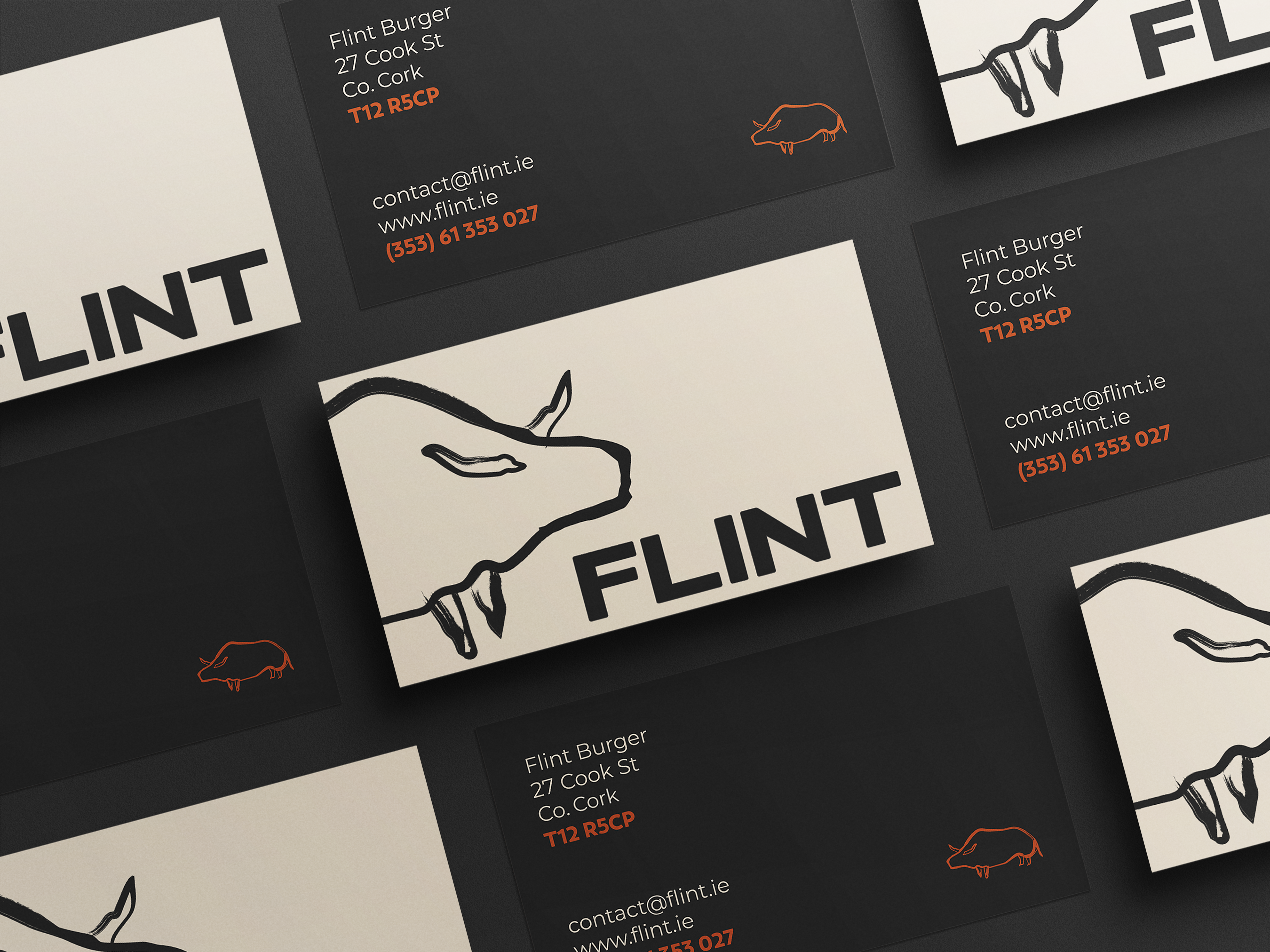
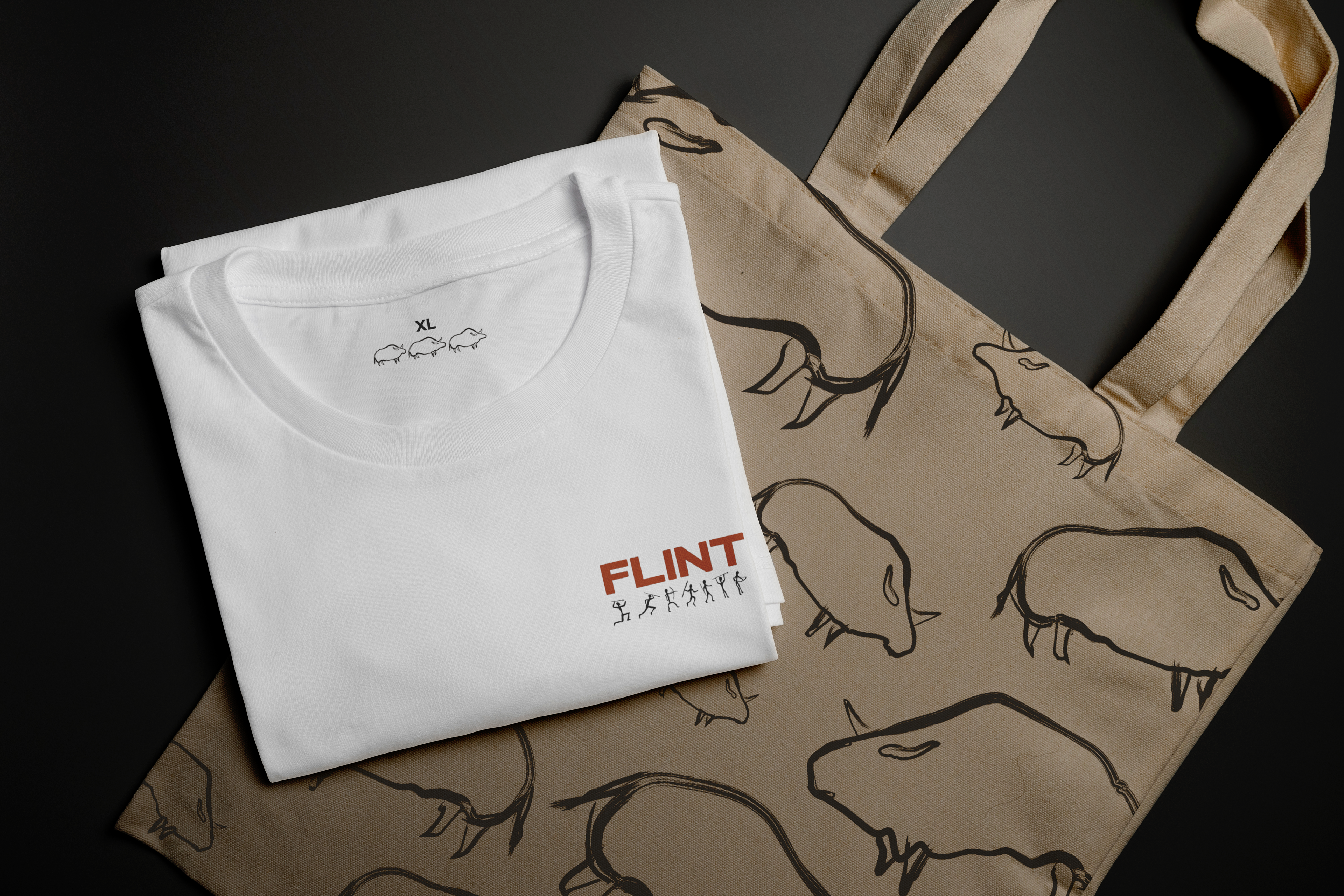
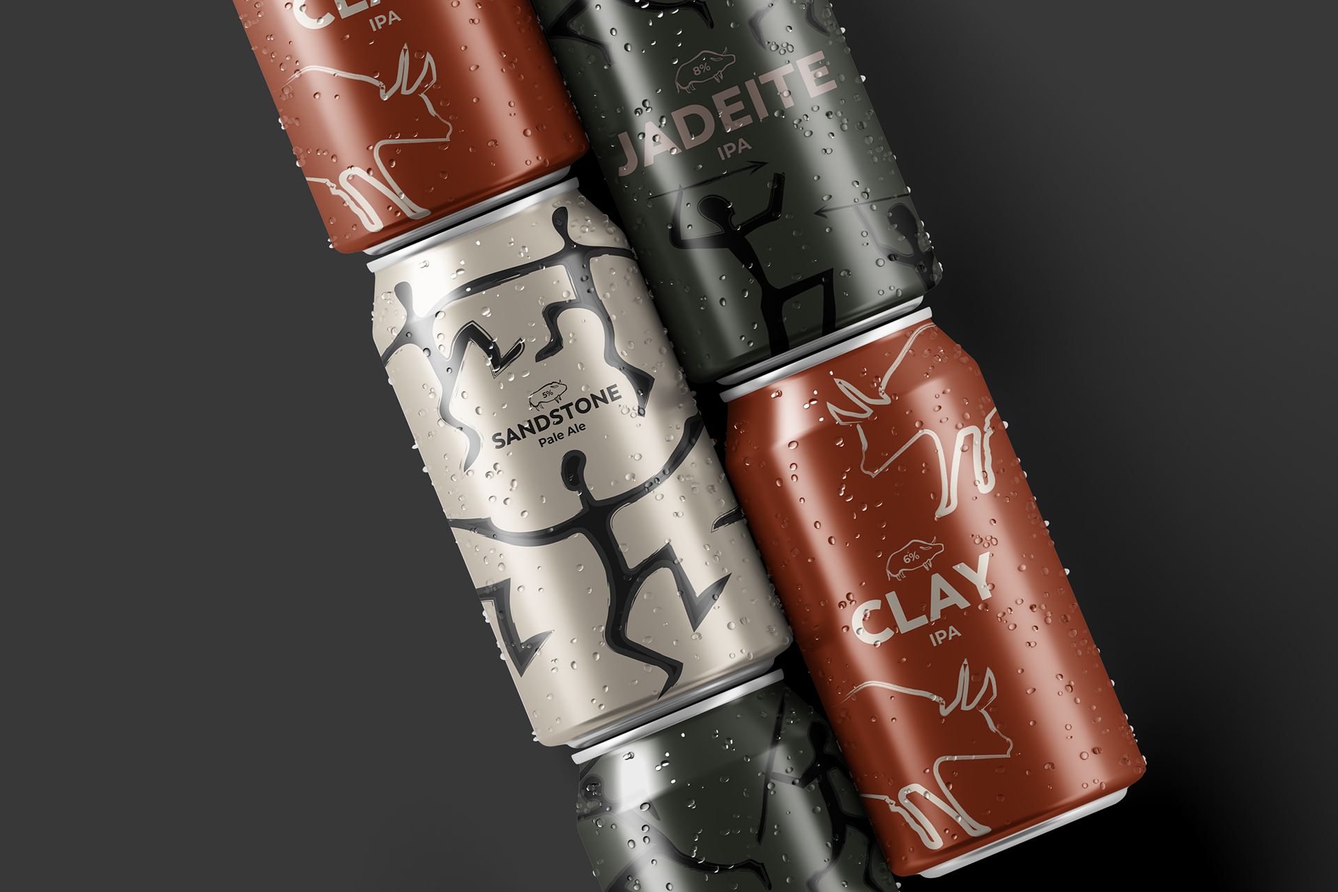
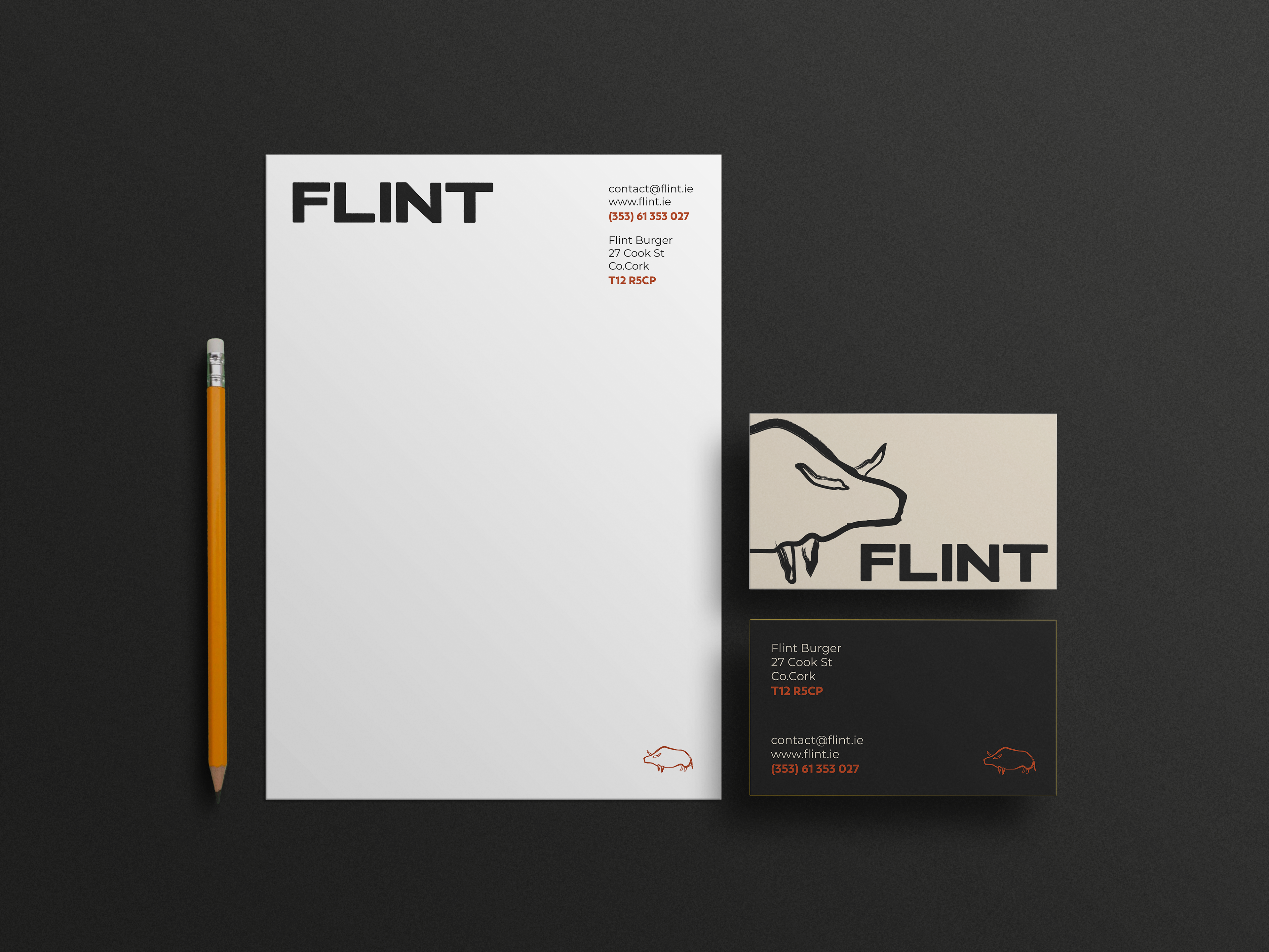
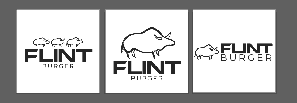
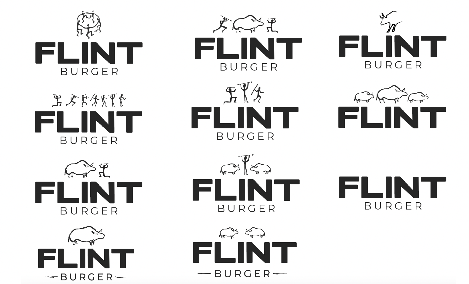
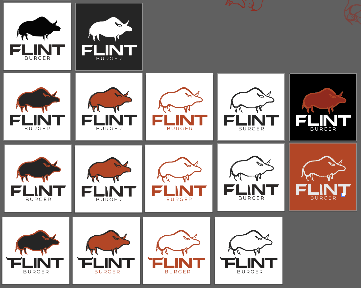
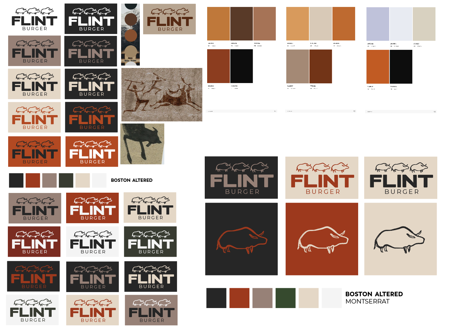
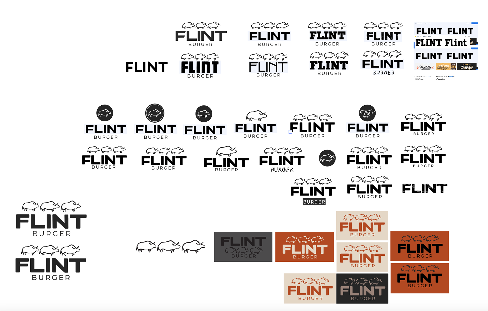
The visual approach for the identity honed in on the concept of basics and leaned on the business name, creating petroglyph style illustrations across different areas of the brand to create a cohesive narrative that mirrors Flint's values and reflects the service they offer.
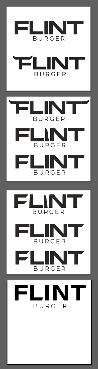
The logo, in a neolithic style, was created to be a versatile stamp that, with slight adjustments, could identify various elements of the business while remaining instantly recognisable.

The Outcome
The outcome is an adaptable visual that is applicable across in-situ and digital elements of the business. The dynamic nature of the visuals allows for the identity to expand and adapt as the business grows.